Why One Picture Is Never Enough
A single photo works for a simple message, like a product drop, a short announcement, or one reaction shot. Most Story moments are not that simple.
Take a pop-up event. You may have the venue setup, the line outside, product close-ups, customer moments, and the final packed table. One image loses the momentum. Posting all of them badly creates clutter. The goal is turning several images into a sequence people want to watch.
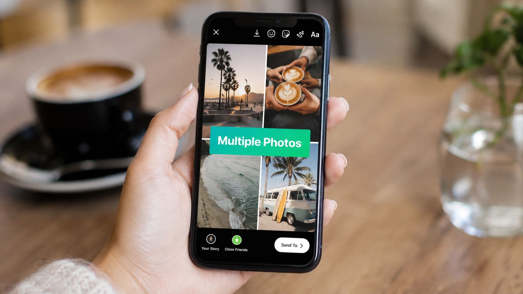
That is why adding multiple pictures to Instagram Story matters for creators, brands, and small teams posting in real time. You are not just uploading more assets. You are shaping pacing, context, and visual hierarchy.
Four ways creators usually handle it
Most practical workflows fall into four buckets:
Layout for speed when you want a clean collage inside Instagram
Photo stickers for creative control when you want overlap, layering, and a more editorial look
Multi-select uploads for sequences when each image deserves its own frame
Third-party design apps for branded execution when native tools start feeling limiting
Each method solves a different problem.
One photo says what happened. Multiple photos show why it mattered.
If you want better retention, more replies, or more taps on a link sticker, presentation matters as much as image quality. If you're trying to grow your audience with Stories, one of the fastest wins is better structure, not more posting.
Creating Instant Collages with Instagram Layout
Layout is the fastest way to put several photos into one Story frame without leaving Instagram. It works well for side-by-side comparisons, short event recaps, or product shots that need equal weight.
It works best when viewers should understand the message at a glance.

How to build a collage fast
Open a new Story, choose Layout, pick the grid that fits your content, then fill each cell from your camera roll or camera.
Start a new Instagram Story.
Select Layout from the Story tools.
Choose the grid that fits your images.
Add your photos to each section.
Reposition each image so faces, products, or text stay inside the crop.
Balance the collage, then add text, stickers, or music.
Publish it as one Story slide.
Layout gives you a fixed grid with a limited number of slots, so it works best for compact storytelling. Force too many ideas into one frame and each image loses impact.
Where Layout performs well
Use Layout when each image answers the same question.
Good examples include:
Product comparisons across colors, sizes, or packaging
Before-and-after sets where side-by-side viewing matters
Menu, outfit, or mood-board roundups with equal-priority visuals
Event snapshots where one frame can summarize the atmosphere quickly
The strength is clarity. The weakness is hierarchy.
A single collage often gets better completion than a string of loosely connected Story slides because it asks for only one tap commitment. But if the collage feels crowded, viewers skim instead of pausing, which can hurt sticker taps and replies. Layout works best when the goal is quick understanding, not layered storytelling.
The practical limits of a grid
Every box in a Layout collage gets similar visual weight. That helps for comparisons. It hurts when one image should lead, and the others should support it.
If you are promoting a product launch, a hero shot plus three detail shots can feel weaker in Layout than in a sticker-based composition. The grid flattens priority. For a recap of four equally strong moments, that same structure keeps the Story clean and easy to process.
Cropping matters more than many people expect. Before you build the collage, check your source images against Instagram post and Story size recommendations so faces do not get cut off and product labels do not disappear at the edges. If your images need cleanup first, MerchLoom's Instagram Story background tips can help remove distracting backdrops and make the collage feel more intentional.
Use Layout when the images deserve equal billing, and the viewer should get the point fast. Skip it when you need depth, overlap, or a clear hero image.
Creative Freedom with the Photo Sticker Method
The Photo Sticker method gives you more control than Layout. Instead of forcing images into a grid, you place one background image or video first, then layer extra photos on top as movable stickers.
That creates more depth and personality. You can tilt images, overlap them, create a scrapbook effect, frame a testimonial over a product shot, or build a loose collage that feels less templated.

How the sticker workflow actually works
Start with the visual anchor first. That might be a full-screen photo, a plain background, or a short video clip.
Then:
Add your base image so the Story has a clear backdrop
Tap the sticker tray and choose the photo option
Insert one extra image at a time from your camera roll
Resize and rotate each sticker so the composition feels intentional
Leave breathing room for captions, polls, or link stickers
This method rewards restraint. Too many floating elements make the Story look accidental.
For creators who care about backgrounds, color contrast, and text readability, MerchLoom's Instagram Story background tips are useful because background choices often determine whether layered images look editorial or chaotic.
The layering rule almost nobody explains
Most walkthroughs show where the Photo sticker button is. They skip the detail that causes the most frustration.
According to a Reddit discussion focused on this exact problem, Instagram automatically places the most recently selected photo as the top layer, which means the stacking order does not follow the visual logic many users expect, as noted in this layering-order discussion.
That changes how you should build the collage.
If you want:
a background cutout at the bottom,
a product shot above it,
and a logo or detail image on top,
select them in the reverse order of how you want them stacked.
Add your bottom layer first, your top layer last. That is the simplest way to control the final composition.
That small change saves time because you do not have to keep deleting and re-adding stickers to fix overlap.
What this method does better than Layout
Photo stickers are the right choice when the Story needs hierarchy.
Use them for:
Testimonials over product imagery
Outfit breakdowns where one image is the main frame and details float around it
Scrapbook-style recaps
Branded Story designs that need more personality than a grid can offer
If you want to push that design style further, these ideas for making Instagram stickers work better visually are useful because sticker-heavy Stories fall apart when spacing and placement are inconsistent.
The downside is time. Sticker Stories usually take longer to build well. But when the Story needs texture instead of speed, this is often the better tool.
Building Narratives with the Multi-Select Upload
You leave an event with 40 usable photos and 10 minutes to post. A collage feels too compressed, but dumping frame after frame into Stories usually loses people before the payoff. Multi-select works best in that middle ground, where sequence adds meaning and each slide has a job.
On Instagram, multi-select queues several images at once and posts them as individual Story frames in the order you choose. The numbered checkmarks matter because they become your narrative structure. If the order is wrong, the Story feels sloppy even when the photos are strong.

What multi-select actually does well
Multi-select is for progression, not design.
Use it when one image sets up the next:
behind-the-scenes coverage that builds toward the final reveal
tutorials where each step changes the viewer's understanding
event recaps that move from setup, to crowd, to highlight moment
product launches that start with intrigue and end with the CTA
That sequencing advantage is the whole point. If viewers need chronology to understand the post, separate slides are stronger than squeezing everything into one frame.
The engagement trade-off
Every extra slide asks for another tap or another second of attention.
A longer sequence can raise engagement when the Story has momentum. It can also hurt completion rate if slides repeat the same angle, lighting, or message. In practice, five distinct frames usually outperform ten similar ones because the viewer feels progress instead of padding.
Treat multi-select like editing a shortcut. Keep the opener strong, trim duplicates, and make sure slide three is not repeating slide two.
Separate slides vs. one-frame summary
Use this filter before posting:
Local partnerships: Partner with nearby businesses by exchanging shoutouts, creating collaborative posts, or running joint campaigns to reach each other's local audiences.
Social proof: Regularly repost customer Stories, reviews, testimonials, and feedback to build trust and show real experiences with your business.
Reels: Turn frequently asked questions into short, informative Reels that educate potential customers while increasing your reach.
DMs: Respond to direct messages promptly and guide interested people toward the next step, whether that's visiting your location, booking an appointment, or making a purchase.A product teaser is a good example. Start with the packaging, follow with the product in use, then end on the detail shot and sticker CTA. That arc gives each frame a reason to exist.
A brunch recap usually does not need that treatment. One strong collage often performs better because the value is the overall mood, not the order of events.
How to keep a sequence from losing viewers
The first frame has one job. Earn the next tap.
Use these rules:
Lead with the sharpest image, not the first one you took
Cut near-duplicates even if you like them
Cap the sequence early if the message is already clear
End with purpose, such as a poll, link sticker, product tag, or reply prompt
This is also where outside planning helps. If you want to compare photo sharing applications, pay attention to which tools make fast sorting and batch selection easier before you get into Instagram.
A simple rule for choosing this method
Choose multi-select when order changes meaning. Choose a collage when the images support the same message at once.
That distinction keeps Stories tighter and protects completion rate, which is often the first metric to slip when a batch upload turns into an unedited slideshow.
Advanced Storytelling with Third-Party Apps
Instagram's native tools are good for speed. They are not always enough for brand control.
If you post Stories casually, native features are usually enough. If you manage a brand, creator business, product line, or recurring content series, third-party apps start to make sense because they let you design before Instagram compresses everything into a quick mobile edit.

What outside apps do better
The advantage is not just prettier templates. It is consistency.
Third-party editors are better when you need:
repeatable branded layouts for weekly recaps, promotions, or testimonials
font and color control that matches the rest of your brand
cleaner alignment tools than finger-dragging inside Instagram
more advanced collage styles than the standard native grid
animated text or movement that feels designed, not improvised
For brands posting frequent Stories, this matters because a cohesive look helps people recognize your content before they read it.
Where native tools still win
Instagram's own editor still has two major benefits. It is faster, and it keeps you close to the posting moment.
If you are at an event, reacting to live news, posting behind-the-scenes footage, or turning around content in minutes, native usually wins. Third-party design only helps if the extra polish will matter.
Use Instagram when speed is the advantage. Use an external app when presentation is the advantage.
Good use cases for app-based Story design
External design tools earn their keep for:
Product showcases that need consistent spacing, branded headers, and cleaner image framing
Before-and-after posts where alignment needs to be precise
Weekly roundups that should look like part of an ongoing series
Campaign assets where Story slides need to match feed posts or ads
If you're evaluating tools beyond Instagram's built-ins, it helps to compare photo sharing applications based on workflow and output style, especially if your team collaborates across events, campaigns, or client accounts.
The real trade-off
The risk with third-party templates is over-design. Plenty of Stories look polished but lose urgency. They feel like mini posters instead of content people want to tap through.
Use external apps when the Story needs structure you cannot build quickly inside Instagram. Do not use them to decorate weak content.
For most creators, the best workflow is hybrid. Build high-stakes or recurring assets outside the app. Use native tools for spontaneous content. That keeps Stories both branded and alive.
Quick Fixes for Common Multi-Photo Glitches
Most multi-photo Story problems come from using the wrong upload path for the result you want.
Your photos became separate slides instead of one collage
Instagram's multi-select flow creates a sequence of Story frames, not a collage on one canvas. If you wanted one screen with several images visible at once, use Layout or add images one by one with the Photo Sticker tool.
Separate slides give each image more space, but they also ask for more taps. A single collage keeps the viewer in one frame and works better for roundups, mood boards, product variations, or before-and-after comparisons where context matters more than full-screen detail.
The photo sticker option is missing
Feature rollouts vary by account and app version, so the tool may appear on one profile and not another.
Start with these fixes:
Update Instagram
Force close and reopen the app
Switch to another account and test there
Start from a fresh Story background instead of a gallery-first upload
If the sticker still does not appear, use Layout or build the collage outside Instagram and upload the finished image.
Your Story looks blurry after posting
Blurry Stories usually come from weak source files, aggressive cropping, or repeated resizing inside the editor. A preview can look fine and still publish soft once Instagram compresses it.
If this keeps happening, review these common reasons Instagram Stories turn blurry after upload. The fast fix is simple. Start with higher-resolution photos, avoid excessive pinch-zooming, and finalize framing before adding stickers and text.
Instagram crashes when you add too many images
This is usually a device or app stability issue, especially if you are stacking edits across multiple frames.
Try this:
Select fewer images at a time
Close background apps first
Post the sequence in smaller groups
Relaunch Instagram before rebuilding the Story
If a Story needs lots of text, stickers, and cropping, it is often safer to build fewer frames with clearer intent than to force a long sequence that may fail before publishing.
Your collage shifts after publishing
A layout that looks centered in the editor can feel off once the Story is live. Instagram's interface covers parts of the top and bottom, and stickers placed too close to the edges can look cramped or slightly misaligned after posting.
Leave more breathing room than the preview suggests. Keep key faces, text, and product details away from the outer edges. That small adjustment usually improves both composition and readability.