Why Brand Guidelines Are Your Growth Blueprint

Many people view brand guidelines as a stuffy rulebook designed to stifle creativity. I see it differently. Think of it as a strategic blueprint for growth. It’s the single source of truth that gets every single department—from marketing and sales to product and even HR—on the same page.
When everyone’s aligned, you’re delivering a unified customer experience at every single touchpoint.
This isn't just about looking slick; it hits your bottom line directly. A consistent brand feels credible and familiar, which are the absolute cornerstones of customer trust. I mean, think about it: 81% of consumers say they need to trust a brand before they'll even consider buying from it. When your branding is all over the place, it just creates confusion and chips away at that essential trust.
Connecting Consistency to Revenue
The financial upside of brand consistency is impossible to ignore. Companies that nail this can see their revenue jump by 10-20%. Some even report gains north of 20% when their guidelines are applied correctly. It all comes down to recognition. A consistent brand becomes instantly recognizable, which smooths out the buyer's journey and encourages loyalty.
> A strong brand guide ensures that whether a customer sees a social media ad, reads a blog post, or talks to a sales rep, they feel like they're interacting with the same brand. That predictability makes people feel secure and way more willing to invest in what you're selling.
From Confusion to Clarity
Without clear guidelines, you’re basically leaving your brand identity up to individual interpretation. What happens next is predictable: marketing is using one color palette, the sales team is using another font, and your social media looks like it belongs to a completely different company.
It looks unprofessional, disorganized, and it costs you opportunities.
A well-crafted guide eliminates all that guesswork. It gives your teams practical, actionable instructions that empower them to be creative within a defined framework. It’s about channeling their energy effectively, making sure every piece of content, every design, and every customer chat reinforces who you are.
If you want to get into the nuts and bolts of putting one together, this comprehensive guide on how to create brand guidelines is an excellent place to start.
Laying the Foundation: Your Brand’s Core Identity
Before you even think about a logo, a color palette, or a font, you have to get to the heart of your brand. This is the non-negotiable first step. It's about defining your brand’s soul, that intangible thing that makes you you.
Getting this right ensures every visual choice, every piece of copy, and every customer interaction feels authentic and connected. Think of it as the strategy behind the style. This isn't about slapping a generic mission statement on your website; it's about digging deep to uncover your brand's true personality, its core values, and the unique point of view it brings to the table.
What's Your Brand's Personality?
If your brand walked into a room, who would it be? Is it the wise mentor, the rebellious innovator, or the down-to-earth friend? Giving your brand human characteristics makes it relatable and memorable.
One of the best shortcuts here is using brand archetypes. They're like universal personality templates that people instantly understand.
The Hero: Think Nike. Inspiring, determined, and all about overcoming challenges.
The Sage: Think Google. A trusted source of wisdom, knowledge, and truth.
The Explorer: Think Patagonia. Adventurous, independent, and pushing boundaries.
Picking an archetype gives your entire team a powerful gut-check tool. When faced with a decision, they can ask, "Is this something a Sage would do?" or "Does this sound like a Hero?" It keeps everyone on the same page. For a dose of inspiration, check out how other companies have built their identities in these awesome small business branding examples.
Before you can design anything, you need to know who you're designing for. The list below breaks down the essential components that form the bedrock of your brand's identity.
Key Components of Your Core Brand Identity
Brand Personality defines your brand’s human characteristics and traits. The key question to answer is: If my brand were a person, what would they be like?
Mission defines your company’s purpose—why you exist beyond profit. The key question to answer is: What is our fundamental reason for being in business?
Vision defines the future you are trying to create. The key question to answer is: What impact do we want to have on the world?
Core Values define the non-negotiable principles that guide your actions. The key question to answer is: What beliefs do we hold that will never be compromised?
Target Audience defines the specific group of people you serve. The key question to answer is: Who is our ideal customer, and what do they care about?
Answering these questions honestly provides the strategic filter for every single branding decision that follows.
Define Your Mission and Core Values
Your core values are the principles you live by, no matter what. Your mission is your reason for getting out of bed in the morning (besides making money). These aren't just fluffy words for your "About Us" page—they're active, decision-making tools.
> Let’s say one of your core values is sustainability. That single word immediately starts making decisions for you. It dictates your packaging materials, the partners you choose for your supply chain, and even the tone you take in your marketing. It’s a filter for everything you do.
This kind of deep alignment is what builds real trust with customers. Given that it takes 5-7 impressions for someone to even remember a brand, every single touchpoint needs to tell the same, consistent story. When your actions line up with your stated values, people notice. This consistency is absolutely critical for brand recognition in a crowded market.
Nail Down Your Key Messaging
Now that you know who you are and what you stand for, it's time to figure out what you want to say. Your key messages are the core ideas you want to lodge in your audience's brain. They need to be sharp, simple, and consistently sprinkled across all your communications.
Your messaging should provide clear, immediate answers to your customers' biggest questions:
What problem are you solving for me?
Why are you better or different from the other options out there?
What feeling should I have when I think about your brand?
With your personality, values, and key messages locked in, you’ve built a solid strategic foundation. From here on out, every choice—from the curve of your logo to a reply on social media—is guided by this core identity. It's the only way to build a brand that feels true and stays consistent over time.
Building Your Visual Identity Toolkit
Now that you’ve pinned down your brand’s core personality, it’s time to bring it to life. We’re going to translate that feeling into a tangible, visual system—the toolkit that makes sure your brand looks and feels the same everywhere, from a billboard to a business card.
This isn’t just about making things pretty. It’s about creating a recognizable visual language that removes guesswork and empowers anyone on your team to create materials that are undeniably yours.
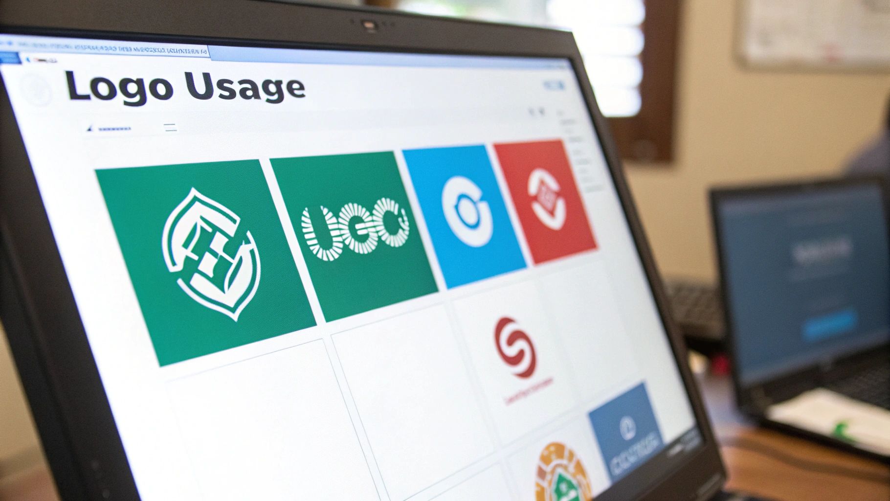
Mastering Your Logo Usage
Your logo is the face of your brand. It’s the single most recognizable asset you have, so protecting its integrity is non-negotiable. It’s not enough to just have a logo; you need to be crystal clear on how it should—and shouldn’t—be used.
This is how you prevent those all-too-common cringe moments: the stretched logo, the weird color version, or the one that’s crammed into a corner. These mistakes dilute its power.
You need to establish clear, simple rules for a few key areas:
Clear Space: Think of this as the logo’s personal bubble. It’s the mandatory “breathing room” you must maintain around it. A great rule of thumb is to use a part of the logo itself—like the height of a specific letter—as the measurement for this space. This ensures it never feels crowded.
Minimum Size: How small is too small? You need to define the absolute smallest your logo can appear in both print and digital formats. This is crucial for preventing it from becoming an unreadable smudge on a tiny mobile screen or a blurry mess on a business card.
Incorrect Usage: Don’t just tell people what to do; show them what not* to do. Visual examples are incredibly powerful here. Create a "rogues' gallery" of common mistakes: distorting its proportions, slapping it on a busy background, changing its official colors, or adding cheesy drop shadows.
Defining Your Color Palette
Color triggers emotion. It's often the very first thing a customer connects with, long before they read a single word. A well-defined color palette is the key to building that instant brand association and maintaining consistency.
But a palette is more than just a collection of nice colors. It has to be functional. It’s about creating a hierarchy that tells the eye where to look.
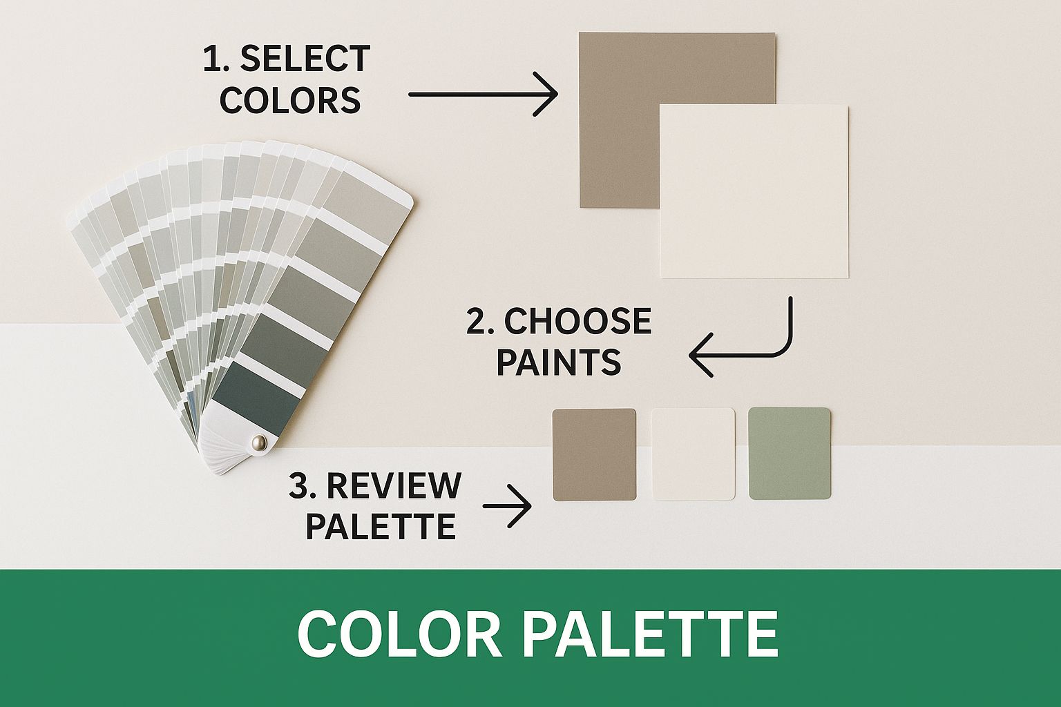
This kind of visual breakdown shows how a brand’s color system actually works in practice. You have your core, foundational colors, and then your accent colors that provide pops of energy. A solid palette gives designers a framework that offers both consistency and creative flexibility.
> Your brand guide absolutely must specify the exact color codes for every possible context. This is non-negotiable. Always include HEX codes for web, RGB values for digital screens, and CMYK formulas for anything that will be printed.
Choosing Your Brand Typography
Typography gives your brand a voice. The fonts you pick say a ton about your personality. Are you modern and minimalist? Traditional and elegant? Playful and bold? It all comes through in your type choices.
For a great example of this, look at the strategic choice of a brand font like YouTube's custom typeface, which perfectly captures their identity.
Your guidelines need to establish a clear typographic hierarchy so everything feels organized and intentional. Think in terms of a simple system:
1. Primary Font (Headlines): This is your workhorse, the attention-grabber. It should be distinct and reflect your brand’s personality.
2. Secondary Font (Body Text): Readability is king here. This font is for longer blocks of text and needs to be clean and easy on the eyes, while still complementing your primary font.
3. Accent Font (Optional): Use this one sparingly for things like pull quotes or special callouts to add a bit of flair.
For every font, make sure you specify the family, the different weights to use (like Regular, Bold, or Light), and clear rules for application. When you do this, every piece of text—from a major website heading to a tiny email signature—works together to tell a cohesive visual story.
If you want to go deeper on how these elements shape your brand's narrative, check out these powerful visual storytelling techniques.
Finding Your Unmistakable Brand Voice
How your brand sounds is every bit as important as how it looks. Once you've nailed down the visuals, the next big piece of the puzzle is your brand voice—that distinct personality that shines through in every word you write.
This isn't about picking a few generic adjectives like "friendly" or "professional." A truly effective brand voice is specific and, more importantly, actionable. It’s what ensures a tweet, a support email, and a product description all sound like they came from the same person. This kind of verbal consistency is huge for building trust and making your brand feel human.
Ditch the Vague Adjectives for Actionable Traits
First things first: we need to get more specific than "helpful." What does "helpful" actually sound like when you're writing? Does it mean using simple, direct language? Or does it mean striking a patient in, reassuring tone?
A voice chart is a fantastic tool for this. It helps you translate those abstract personality traits into concrete, real-world writing rules.
Confident means we speak with authority and clarity. To do this, use declarative sentences. Don’t use hedging words like “might” or “perhaps.”
Witty means we find clever ways to be engaging. To do this, use puns and pop culture references. Don’t make jokes at the user’s expense.
Empathetic means we understand and validate customer feelings. To do this, use phrases like “We get how frustrating that can be.” Don’t be dismissive with responses like “Actually, you should have…”
This simple chart removes all the guesswork for anyone writing for your brand. It becomes a practical guide for everything from a punchy social media caption to a more serious customer support email.
Knowing When to Adjust Your Tone
Here’s a crucial distinction: your core brand voice should never change, but your tone absolutely should.
Think of it this way: your personality (your voice) is the same whether you're talking to your best friend or your boss. But your delivery (your tone) changes dramatically depending on the situation. Your brand needs to do the same thing.
Social Media: Your tone can lean more playful, casual, and witty.
Customer Support: Here, the tone needs to be empathetic, patient, and crystal clear.
Sales Pages: On these pages, your tone can be more persuasive, confident, and focused on benefits.
The trick is to define these tonal shifts right in your brand guidelines. Give your team real examples of how to dial the tone up or down for different channels without losing that core personality. This makes sure your brand is consistent but also smart enough to read the room.
> Your brand voice is the strategic foundation—it's what you say. Tone is the tactical application of that voice—it's how you say it in a specific context to make sure the message lands.
Ultimately, a well-defined voice and tone guide empowers your whole team to communicate as one cohesive personality. When you pair this with an asset library full of templates, graphics, and icons, you give everyone the tools they need for quick, on-brand creative work.
These elements combine to create operational blueprints that allow your teams to execute branding with unerring consistency. If you want to dive deeper into how all these pieces fit together, you can find some great additional brand identity insights here. This structure is what allows you to scale your communication without watering down your brand’s character.
Sharing Your Guidelines for Maximum Impact
Putting the final touches on your brand guide is a huge accomplishment, but let's be real—it's only half the battle. If that brilliant document ends up buried in a forgotten folder on some shared drive, it’s not doing its job. To get that consistency you're after, you need to turn your guidelines into a living, breathing resource that your entire team and any external partners actually use.
The goal is to shift your guide from a static document to an active tool. It’s not just about making it accessible, but making it incredibly easy to navigate and apply. A user-friendly guide empowers people to do the right thing without making them feel like they're being policed.
Ditch the Static PDF for a Dynamic Hub
The days of the dusty, 100-page PDF are numbered. Sure, a PDF is better than nothing, but it gets outdated fast and becomes a pain to sift through. Modern brand guidelines have evolved into dynamic, cloud-based brand hubs. Think platforms like Frontify or Zeroheight.
This shift is a total game-changer for a few key reasons:
Updates happen instantly. When you tweak a color code or add a new logo variation, everyone sees the change in real time. No more version control nightmares.
Everything is in one place. Your internal teams, freelance designers, and partner agencies can all access the same single source of truth from anywhere.
It’s way more engaging. These hubs can include video tutorials, clickable links, and searchable content, which beats a flat PDF any day of the week.
With over 10,000 branding agencies operating worldwide, having a scalable and accessible system isn't a luxury anymore—it's a necessity for keeping everyone on the same page.
> A brand guide should be a destination, not a document. When it’s easy to find what you need, people are far more likely to follow the rules because it’s the path of least resistance.
Make Your Guidelines Incredibly Practical
To get people on board, your guide has to be built for pure usability. Structure it with a clear table of contents and logical sections so users can find answers in seconds. More importantly, it has to be practical.
The best brand hubs include downloadable assets right where you need them. Talking about logo clear space? Put a link to download every approved logo file right there. Outlining presentation styles? Offer a downloadable branded template. This simple move removes friction and makes staying on-brand the easiest option.
This is especially critical when you're dealing with different platforms. For example, our guide on creating social media brand guidelines shows just how important it is to have specific assets and tonal advice tailored to each network. When you provide ready-to-use templates and assets, you make compliance the path of least resistance for your team.
Common Questions About Brand Guidelines
Even with a perfect roadmap, a few questions always come up when you're putting together brand guidelines. It’s totally normal. Most of the tricky parts have pretty straightforward solutions once you know what to look for.
Let's dive into some of the most frequent questions we hear. My goal here is to give you direct answers that will help you sidestep common hurdles and keep your project moving smoothly.
How Often Should We Update Our Brand Guidelines?
Think of your brand guidelines as a living document, not something carved in stone. For them to be truly effective, they need to evolve right alongside your business.
Getting into the habit of a light annual review is a fantastic idea. This simple check-in ensures the guide still syncs up with your current business goals and how you're positioned in the market.
Beyond that, you should probably plan for a more significant refresh every 3-5 years. A major update is also a must whenever your business goes through a big change. We're talking about things like targeting a completely new audience, a major product pivot, or a full-on rebrand. The whole point is to prevent your guide from becoming an outdated relic that nobody on the team actually uses.
What Is the Biggest Mistake to Avoid?
The single most damaging mistake you can make is creating guidelines that are either way too rigid or far too vague. Both extremes create massive problems and completely undermine the purpose of the document.
Overly strict rules can absolutely crush creativity. They make it impossible for your brand to feel authentic or adapt to different situations. Your team ends up feeling like they're working in a creative straitjacket, which leads to bland, robotic content. Nobody wants that.
On the flip side, guidelines that are too loose are just as bad. If everything is open to interpretation, you end up right back where you started: with the same brand inconsistency you were trying to fix. You'll have a document that offers no real direction.
> The sweet spot is a framework, not a cage. Provide clear, non-negotiable rules for your core identity—things like logo usage and primary brand colors. But for everything else, like social media imagery or blog post tone, offer flexible principles. This empowers your team to get creative while still operating within established boundaries.
Who Needs to Be Involved in Creating Them?
Putting together truly effective guidelines is a team sport. It's not a solo mission to be locked away in the marketing department. To get a document that's both strategic and practical, you absolutely need to bring different perspectives to the table.
First off, leadership buy-in is non-negotiable. Without it, the guidelines will have no real authority, and getting company-wide adoption will be an uphill battle. Your core creation team should obviously include the people who live and breathe the brand every day—key players from marketing, lead designers, and senior copywriters.
But don't stop there. It's a huge mistake to leave out your sales and customer service teams. These are the people on the front lines. They have invaluable, firsthand insights into how customers actually perceive your brand. Their input ensures the final guide is grounded in reality, not just marketing theory.
A collaborative process also builds a sense of shared ownership, which makes everyone far more invested in bringing the brand to life consistently.
Ready to grow your brand on Instagram? Gainsty uses expert strategies and advanced AI to help you get real, organic followers—no bots, no fake accounts. Start building an authentic and engaged community today.
Find out more at https://www.gainsty.com

.png&w=1920&q=75&dpl=dpl_4NqwJQkCDvBL9qR9gQoqvMbkri9x)


.png&w=750&q=75&dpl=dpl_4NqwJQkCDvBL9qR9gQoqvMbkri9x)