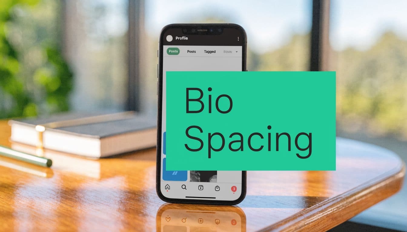
Why Your Instagram Bio Spacing Matters More Than You Think
Someone lands on your profile from a Reel, a Story mention, or a search. The content did its job. The bio has to finish it.
That decision happens fast, and spacing affects it more than many creators and brands expect. In a 150-character field, formatting changes what gets seen first, what gets skipped, and whether your CTA gets noticed at all. Instagram counts everything in that limit, including spaces, punctuation, emojis, and invisible characters, so spacing is not decoration. It is part of the copy.

I have tested bios that used the same words in two layouts and seen the cleaner version win because people could scan it in one pass. That is the primary job of spacing. It reduces hesitation between profile visit and follow.
Spacing affects clarity, trust, and action
A strong bio needs to communicate three things quickly:
Who you are
Why this account is worth following
What the visitor should do next
If those points are separated cleanly, the profile feels sharper and more credible. If they run together, visitors have to decode the message themselves. That extra effort hurts conversion, especially on mobile, where bios are scanned in seconds between other pieces of content.
If you need a quick refresher on what a social media bio is, use that definition as the baseline. Then treat spacing as the mechanism that makes the message readable under pressure.
Better spacing improves follower conversion because it lowers friction
This is a conversion issue before it is a design issue.
Profiles with clear line breaks make it easier to spot the niche, proof point, and CTA. That usually leads to better profile visit-to-follow performance because the visitor does less work. Messy spacing creates the opposite effect. The offer may be solid, but it looks less organized, less intentional, and easier to skip.
The same principle shows up across social content. Readability improves response rates because people act on clear information faster. If you have ever dealt with Instagram Notes not working properly, you have already seen how small formatting problems can change whether a feature feels usable.
Your bio should guide the eye to the follow decision, not make people search for the point.
What usually works, and what hurts results
The strongest bios tend to use spacing with restraint. They separate one idea per line, keep the CTA visible, and avoid wasting characters on decorative fluff.
Weak bios usually break in predictable ways:
Wall-of-text bios: too many ideas packed into one scan
Collapsed formatting: line breaks disappear after saving
Overdesigned bios: symbols and blank space eat useful character count
Buried CTA: the action line gets pushed where fewer people notice it
Clean spacing gives each line a purpose. That makes the profile easier to understand and easier to act on, which is exactly what you want from a field this small.
The Notes App Method for Reliable Instagram Bio Line Breaks
If you want line breaks that stick, stop editing directly inside Instagram first. Draft the bio in a notes app on your phone, then paste it into Instagram.
That’s still the most reliable method because it uses your phone’s native text rendering before Instagram gets a chance to “clean up” your formatting. The method isn’t fancy. It’s just more dependable than typing and hitting return inside the app.

The exact process that works
Use Apple Notes, Google Keep, or any basic notes app. Then follow this sequence:
Draft the bio outside Instagram
Write each line exactly how you want it to appear. Use the return key for every line break.Clean the end of every line
This is a step often overlooked. Delete any extra spaces after the last word on each line.Watch punctuation placement
If a line ends with punctuation, make sure there isn’t a trailing space after it. Instagram often treats that as accidental formatting.Copy the full bio at once
Don’t rebuild it line by line inside Instagram. Copy the entire block.Paste into Edit Profile
Open Instagram, go to Profile, then Edit Profile, then Bio. Paste the text in one action.Preview before saving
Look at the formatting in the editor before you submit. If it already looks compressed there, fix it before saving.
Why does this method beat typing directly in the app
According to Business Insider’s guide to spacing an Instagram bio, the Notes app copy-paste method has a 90%+ success rate on modern iOS and Android devices when trailing spaces are removed, compared with 40% when those spaces are left in.
That one detail matters because Instagram flags trailing punctuation or spaces as unintentional formatting and often collapses the line breaks during cleanup.
Practical rule: If your line breaks disappear, check the end of each line before you try anything else.
The mistake that breaks most bios
People focus on the line breaks. Instagram focuses on the line endings.
Here’s the difference:
“Fitness Coach” – This version usually preserves the line break when placed in a bio or formatted text, making it cleaner and easier to read.
“Fitness Coach ” – This version often collapses the break because of the trailing space or formatting behavior, which can make spacing inconsistent.
“Fitness Coach.” – This version is more likely to get cleaned up automatically by some platforms or formatting systems, sometimes removing the intended break or altering punctuation spacing.
That’s why a bio can look perfect in Notes and fail in Instagram. The problem often isn’t the break itself. It’s the hidden character after the visible text.
Mobile works better than desktop
You can edit a bio on desktop, but mobile is more reliable for spacing. Desktop can work for simple formatting, but once you care about clean multi-line structure, phone-first editing wins.
If you’re already dealing with formatting glitches elsewhere in the app, this guide on Instagram Notes not working is useful because many Instagram text issues come down to app behavior, version quirks, and inconsistent rendering.
My default recommendation
For most accounts, this is the baseline method:
Write in Notes
Keep each line short
Remove trailing spaces
Paste in one go
Check the mobile preview
That gets you most of the way there without using any tricks. If you want full blank lines between sections, that’s where invisible characters come in.
How to Add Blank Lines Using Invisible Characters
A normal line break gives you a new line. It doesn’t always give you a true blank line between sections.
That’s why some bios still feel cramped even when they technically use multiple lines. To create visual breathing room, you need an invisible character that Instagram recognizes as content instead of deleting as empty space.
The most reliable one is the Braille Pattern Blank (U+2800).

Copy this character
⠀
That blockquote contains the invisible character. Copy it carefully. It looks empty, but it isn’t.
According to Castmagic’s guide to Instagram bio spacing, the Braille Pattern Blank is the most effective invisible character for Instagram bios, achieving a near 100% success rate on iOS 17+ and Android 14+. The same source notes that using 2 to 4 of these characters to create visual sections improved readability by 35% in A/B tests.
How to use it correctly
The cleanest way to apply it is simple:
Write your first text block
Insert a new line
Paste the invisible character on that otherwise blank line
Hit return again
Write the next text block
That gives Instagram something to preserve on the “empty” line.
A common structure looks like this:
Line 1: who you are
Line 2: what you do
Line 3: invisible character
Line 4: CTA or link prompt
When invisible characters help, and when they hurt
They work best when you want sections, not decoration.
Good use cases:
separating your niche from your CTA
creating breathing room between credentials and offer
breaking up dense keyword-heavy bios
making a link instruction stand out
Bad use cases:
stacking too many blanks so the bio feels padded
adding empty space without a content reason
forgetting those invisible characters still counts toward your bio limit
A blank line should create emphasis. If it doesn’t help a visitor find the next important line faster, cut it.
A strong formatting pattern
Here’s a clean example structure:
Creator helping small brands grow
Content strategy + reels ideas
⠀
New posts every week ↓
That pattern works because the blank line separates information from action. The visitor reads the offer first, then sees what to do next.
A few trade-offs to keep in mind
Invisible characters are useful, but they’re not free. They consume space, and space is expensive in a 150-character field. That means you should use them intentionally.
If your bio already has very short lines, one invisible-character divider may be enough. If your bio is close to the limit, skip the extra spacing and tighten the words instead.
For most accounts, instagram bio spacing works best when it looks natural. The goal isn’t to show off formatting tricks. The goal is to make the bio easier to scan.
Strategic Formatting for Readability and Conversion
A profile visit is a tiny conversion moment. Someone taps in, scans for two or three seconds, and decides whether to follow, click, or leave. Bio spacing affects that decision because it controls what the eye hits first.
I’ve seen bios with the right keywords underperform because the layout made the value hard to spot. I’ve also seen shorter bios pull better profile actions after one simple change: put the promise on one line, give the CTA its own space, and stop forcing people to decode a wall of text.
Build the bio in a conversion order
The best-performing bios usually follow a clear sequence:
Identity Say what the account is in plain language.
Value Give a concrete reason to follow, book, browse, or trust.
Action Point to the next step. Follow for tips, tap the link, shop the drop, start here.
Spacing matters because it creates hierarchy inside a very small space. If every line carries the same visual weight, the CTA gets buried. If the value line is vague, visitors have no reason to continue. If you want sharper examples of how to position the offer itself, these Instagram bio tips are useful.
Format for scanning, not self-expression
People do not study bios. They scan for proof, relevance, and direction.
That changes how the bio should be formatted. Short lines beat full sentences. Labels beat clever phrasing. One separated CTA line usually beats squeezing the CTA into the middle of the bio.
Useful formatting choices include:
One idea per line
A clear break before the CTA
Emojis only when they clarify the line
Separators like
|only when they save spaceSpecific wording instead of personality filler
A bio is not a brand manifesto. It is closer to a landing page header with room for one supporting line and one action.
Every character has an opportunity cost
As noted earlier, the bio field is tight. Spaces, emojis, and invisible characters all consume room, so formatting decisions affect what message makes it in.
That is the actual trade-off. Extra spacing can improve response if it helps a visitor find the CTA faster. Extra spacing hurts if it forces you to cut the line that explains why the account is worth following.
Here’s the kind of edit that usually improves conversion:
“Lifestyle creator who loves fashion, travel and beauty tips” is a weak layout because it is broad and generic. A better layout would be “Fashion + travel creator” because it is clearer, shorter, and easier to understand instantly.
“Helping women feel confident through style and mindset coaching” can be improved into “Style coach for confidence” because it becomes sharper, more memorable, and easier to scan quickly.
“Check out all my latest links and resources below” is a weak call-to-action because it is long and vague. A better layout would be “Start here ↓” since it is direct, simple, and encourages action immediately.
The stronger version is easier to scan, easier to remember, and easier to act on.
Use spacing to separate the value from the action
The highest-impact spacing pattern is simple. Put the identity and value lines together. Then create a visual pause before the CTA.
Example:
DM strategist
Content systems for service brands
⠀
Book a free audit ↓
That blank divider does one job well. It keeps the action line from getting lost in the description above it.
For creator accounts, the same principle works:
Budget beauty creator
Honest reviews + easy routines
⠀
New favorites below ↓
The spacing is not there for style. It helps the visitor process the offer first, then take the next step.
What to cut first
If the bio feels crowded, remove low-value text before you remove the CTA. In practice, these are usually the first things worth cutting:
vague adjectives like “passionate” or “creative.”
repeated niche words
filler phrases like “welcome to my page.”
extra emojis that do not guide attention
location details that do not support trust or sales
Good bio spacing improves readability. Strategic bio spacing improves profile actions. That is the standard to use when you decide what stays.
Spaced Bio Templates for Influencers, Brands, and Professionals
Templates help because extensive theoretical knowledge isn't always required. They need a starting point that already respects spacing, hierarchy, and brevity.
That matters on Instagram because shorter text tends to perform better across the platform. Hootsuite reports that Instagram posts with 80 characters or fewer receive 66% higher engagement, which supports the same principle these bios rely on: concise, scannable copy tends to work better than crowded copy. You can see that in Hootsuite’s social media post length research.

For influencers and creators
This format works when personality matters, but clarity still has to lead.
Beauty creator
Tutorials + honest reviews
⠀
New picks below ↓
Why it works: the first line labels the niche, the second promises content type, and the final line points action downward. The blank divider keeps the CTA from getting buried.
A stronger variation for educational creators:
Fitness coach
Simple workouts for busy women
⠀
Start with my pinned plan ↓
For e-commerce brands
Brand bios need category clarity fast. Don’t waste the first line on slogans.
Clean candles
Small-batch scents for home
⠀
Shop bestsellers ↓
If the product range is broader, use separators:
Skincare | Body | Travel sizes
Sensitive-skin friendly
⠀
Shop sets ↓
The point isn’t to sound poetic. The point is to remove uncertainty about what you sell.
For service professionals
Coaches, consultants, real estate pros, photographers, and local businesses need authority plus action.
NYC real estate agent
Buyers, sellers, relocations
⠀
Available listings ↓
Or:
Career coach
Resume + interview strategy
⠀
Book a consult ↓
These work because they don’t hide the offer. They state the service plainly, then direct the next move.
Keep the first line descriptive, not decorative. Your visitor should know the account type before they read the second line.
How to customize without weakening the format
When editing these templates, protect the structure first:
Swap the niche, not the layout
Tighten words before removing the CTA
Use one blank divider at most unless the bio feels cramped
Add emojis only if they improve scanning
Most bad template edits happen when someone adds too many traits, too many interests, or too much attitude. If you want your instagram bio spacing to help conversion, keep the shape clean and the wording direct.
Troubleshooting Common Instagram Bio Spacing Problems
Even solid formatting can break. Usually, the issue is small and fixable.
Why did my line breaks disappear after I saved?
Check the ends of your lines first. Hidden trailing spaces are one of the most common reasons Instagram collapses formatting.
Then check the total length. If you’re pushing the limit, formatting can become less predictable. This guide on the Instagram bio character limit helps if you need to trim without losing meaning.
Why does it look fine on my phone but weird on someone else’s?
Different devices can render spacing slightly differently. That’s especially true when you use symbols, stacked invisible characters, or tight alignment tricks.
Fix it by keeping layouts simple:
Use short lines
Avoid overstacking blank characters
Preview on another device if the bio is heavily styled
Why won’t a blank line stay blank?
Because Instagram often deletes empty lines. Use the invisible Braille Pattern Blank on the line you want to preserve. If you just hit return twice, Instagram may compress it.
Can I edit bio spacing on desktop?
Yes, but a desktop is less reliable for polished formatting. It’s fine for text changes. For multi-line bios and clean visual spacing, mobile editing is still the safer option.
Why does my bio feel messy even when the spacing works?
This is usually a content issue, not a formatting issue. Too many emojis, too many separators, or too many ideas can make a spaced bio feel harder to read, not easier.
The fix is usually subtraction. Keep one role, one value statement, and one CTA.
Frequently Asked Questions About Instagram Bio Formatting
Can I use custom fonts in my bio?
Yes, but they usually come from Unicode font generators, not Instagram itself. They can look distinctive, but they may reduce readability and can create accessibility issues. Plain text usually performs better if clarity is the goal.
How do people center their bio text?
They don’t center it. They fake the look with a combination of spaces, short line lengths, and sometimes invisible characters. It can look good, but it’s fragile across devices. Left-aligned bios are more reliable.
Does instagram bio spacing help SEO?
Spacing helps people read your bio faster. That improves user experience and can support conversion. For search visibility, your keywords still matter more than decorative formatting.
Should I use lots of emojis?
No. Use them as signposts, not filler. One well-placed emoji can improve scanning. A line full of them usually weakens clarity.
If you want help turning profile views into real follower growth, Gainsty helps creators and brands improve Instagram performance with organic growth support, AI-powered insights, and strategies specific to your niche.

.png&w=1920&q=75&dpl=dpl_CfG1GpeHTVmJhHNReLSePLW5HS9b)


.png&w=750&q=75&dpl=dpl_CfG1GpeHTVmJhHNReLSePLW5HS9b)