
Why a Collage IG Story Beats a Single Photo
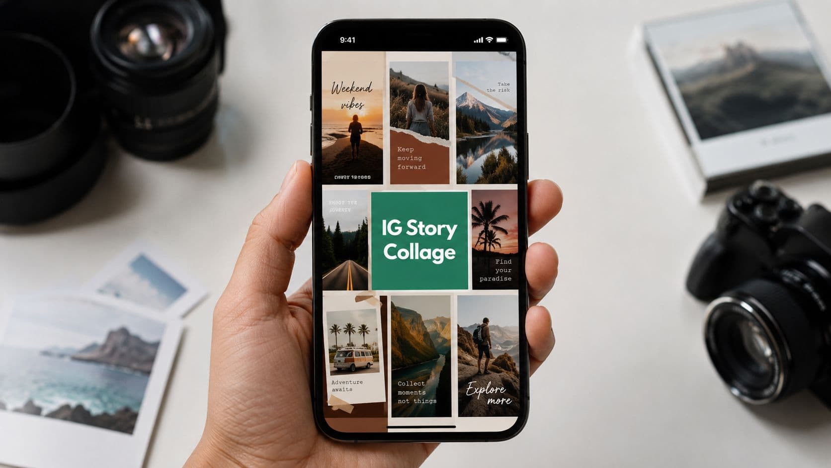
The easiest way to think about a collage IG Story is as a format for moments that need more than one beat. A launch teaser, a behind-the-scenes reset, a before-and-after, or a recap all benefit from showing relationship, not just one pretty frame. A single image can be beautiful and still feel incomplete if the story is really about progression, contrast, or multiple details.
A product drop is the classic example. One clean hero shot says what the product is, but a second supporting frame can show texture, packaging, or scale without making people dig through a carousel. A restaurant can do the same thing with a dish collage, a creator can show the setup and the finished shot, and a service brand can pair the result with the process.
Practical rule: use a collage when the viewer needs context, contrast, or a fast recap. Use a single image when the one frame already tells the whole story.
When a collage earns the slot
A collage works best when the post has a built-in relationship between images. That can be chronological, like “before, during, after,” or thematic, like “three angles of the same launch.” It also works when you want the viewer to pause on the composition itself, because a multi-frame Story naturally creates more surface area for attention.
Behind-the-scenes content is especially strong here. The casual frame, the polished frame, and the detail crop make the moment feel lived in. Recap posts benefit too, because multiple photos can turn a basic memory dump into something that feels edited instead of random.

Using Native Instagram Layout and Photo Stickers
Native Instagram tools are the fastest path when you want the post live now. Layout mode gives you fixed grids, which is ideal when the photos are equally important and you don't want to fight the design. The photo sticker route is looser and more flexible, which is why it's the better choice when one image should dominate and the rest should support it.
Start with a blank Story canvas or a solid color background. If you're using Layout, choose the grid, fill each cell, and move on. If you're building freestyle, add your background first, then place photos with the photo sticker, because later-added stickers sit above earlier ones, and that layer order matters when the focal image should sit on top.
A clean native workflow is simple enough to run almost on autopilot:
Open a blank Story canvas. Use a color background if the photos need contrast.
Choose Layout for uniform grids. Two-photo, four-photo, or six-photo templates are the quickest way to keep things tidy.
Use the photo sticker for freestyle collages. Drag to position, pinch to resize, and use two fingers to rotate.
Add the hero image last. If the focal asset must sit on top, give it the last layer or reorder it manually.
Save a flattened version. Instagram can't reopen a posted Story for editing, so a saved composition is your reusable master.
The photo sticker approach is the one I use when a Story needs personality without leaving Instagram. You can cycle the sticker frame style if you want a different feel, and you can save the finished composition as a flattened image for reuse or reposting. That matters because once a Story is saved and posted, the canvas itself isn't meant to be re-edited.
For a straightforward walkthrough, this Instagram Story multiple photo guide matches the native workflow well. It's the kind of setup that gets you from camera roll to posted Story without opening another app.
Build native when speed matters, then stop editing before the layout starts feeling busy. The app rewards clarity more than cleverness.
Third-Party Apps and Template Workflows Worth Trying
Native tools cover the basics, but the moment you want custom typography, brand colors, or animation, a second app starts making more sense. The question isn't which app is “best.” It's which one saves time without boxing in the final export.
Here's the practical split. Free collage apps are best when you want quick assembly and minimal learning. Template platforms are better when you want brand consistency and polished type. Full creative suites are for people who need complete control and don't mind spending more time setting up the canvas.
Free collage apps: Best for quickly combining multiple photos into simple layouts with minimal effort. They have a low learning curve, making them beginner-friendly, and typically offer moderate export control with fewer customization options.
Template platforms: Best for creating branded Instagram Stories, polished typography, and reusable content formats. They have a low to medium learning curve and provide strong export control, making it easy to maintain a consistent visual identity.
Full creative suites: Best for custom designs, advanced image editing, precise layering, and professional file preparation. They have a medium to high learning curve but offer the highest level of export control and creative flexibility.
Picsart, Canva, Adobe Express, CapCut, Photoshop, and Affinity Photo all live in this ecosystem, but one tool usually stands out in each category depending on the job. Canva is the template platform many creators default to because it handles quick layout decisions well. Photoshop and Affinity Photo make more sense when you care about exact control over spacing, masks, and output. CapCut is the obvious fit when the collage should feel video-first instead of static.
Sovran's creative testing platform is useful if you're comparing Story ad-style layouts before you publish them. It sits in the middle ground between pure design and pure publishing, which is where a lot of collage decisions get made.
The downside of third-party tools is usually the same trio of problems. Free tiers can leave you with watermarks, brand work can get messy if font licensing isn't clear, and templates can become a crutch if every Story starts looking identical. The fix is to use templates as a base, then swap in one distinctive visual element, like a repeat color, a custom frame, or a consistent text weight.
The fastest method is rarely the most flexible. The most flexible method is rarely the fastest. Pick the level of control that matches the Story's purpose, not your mood at the moment you open the app.
Sizing, Safe Zones, and Export Settings
A strong collage can still fail if Instagram hides the important part behind its own interface. The cleanest setup starts with the correct canvas and ends with an export that won't blur when you post or reuse it later. For Stories, the standard canvas is 1080 x 1920 pixels in a 9:16 ratio (Gainsty's size guide for Instagram post formats).

The main design mistake is crowding the edges. Instagram overlays the username strip at the top and reply controls near the bottom, so text, CTA buttons, and key visuals need breathing room in the center. If the collage has a headline, keep it out of the most exposed edge areas and let the middle of the frame do the heavy lifting.
PNG is the safer choice for graphics-heavy collages with hard edges and text. JPEG makes sense for photo-led compositions when file weight and image fidelity are both important. If you're exporting video, keep the file under 8 MB when possible, because oversized media creates unnecessary friction in the upload process (Gainsty's size guide for Instagram post formats).
The best habit is to export a little bigger than you think you need. Instagram only displays so much, but the same asset may end up reused as a highlight cover, reposted as a reel frame, or adapted for another platform. A finished, high-quality master gives you that flexibility without rebuilding the collage from scratch.
Save the master file first. Once the composition is flattened and exported cleanly, every later use gets easier.
Composition Rules That Make Collages Readable
A collage reads well when the viewer knows where to look first. That sounds obvious, but a lot of Story collages fail because every panel competes for attention at the same volume. The fix is to create a clear lead image, then let the rest of the frame support it instead of shouting beside it.
Lead with one dominant frame
The strongest Story collages usually give one image the most visual weight. For a product launch, that hero image might take most of the canvas while smaller frames show the details. For a behind-the-scenes post, the main action can sit in the biggest panel while candid moments frame the edges.
That hierarchy does more than make the design prettier. It reduces friction. A viewer should be able to understand the post in a glance, then notice the supporting visuals on the second beat.
Leave room for taps and eyes
Whitespace is not empty space, it's structure. If a text caption or sticker touches every edge, the collage becomes harder to read and more likely to clash with Instagram's interface. The visual storytelling techniques guide lines up with this idea well, because strong visual rhythm depends on what you leave out as much as what you add.
Give the viewer one job at a time. If the collage makes them work too hard, they swipe away.
Tie the frame together
The most readable collages share something across the panels. That can be a repeated color, a similar contrast level, a matching border weight, or a theme that links the images without making them identical. A recap post can even use chronological reading order, left to right, so the Story feels like movement instead of a pile of moments.
The mistake is overloading the page with decorative elements just because the template allows it. More boxes do not equal better design. A clean collage with one dominant frame, controlled contrast, and a tight color relationship usually outperforms a noisy one that tries to show everything at once.
Captions, Stickers, and CTAs That Lift Engagement
A collage gets the tap, but the interaction usually comes from what you ask next. That's why the text layer, sticker choice, and CTA placement matter as much as the image arrangement. If the collage is doing all the talking, you're leaving replies on the table.
The simplest fix is to keep the caption short and place it where it won't fight the visuals. A line of context in the top portion of the frame usually works better than a paragraph squeezed into the center. For captions and accessibility support, the captions for Instagram Stories guide is a useful reference point when you want the text treatment to feel intentional rather than decorative.

Put the interaction on the next frame
Polls, quizzes, question stickers, countdowns, and link stickers all have their place, but I rarely cram the whole interaction into the collage itself. A better pattern is to post the collage as Story 1, then use the next frame or two to ask the question. That sequencing gives the collage room to breathe and lets the engagement prompt feel like a conversation instead of a billboard.
A restaurant can post a dish collage, then follow with a poll asking which menu item people want next. A creator launching a product can pair the collage with a countdown sticker on the next Story. A small business can place a link sticker on a UGC roundup and keep the collage focused on the visuals.
Top placement for captions: keep text in the upper area so the interface doesn't hide it.
Final-panel interaction: place the poll or quiz on the last panel if the whole collage is meant to stay self-contained.
Clear CTA language: “Tap to learn more” works better than vague filler because it tells people what to do.
A simple question usually beats a forced sales line. If the Story sounds like something a friend might ask after seeing the collage, replies feel natural instead of mechanical. That's the version people tap through and answer.
Troubleshooting Common Collage IG Story Problems
Most collage problems come from the same place: the final asset wasn't built with Instagram's quirks in mind. When stickers shift, text disappears, or the image turns soft after upload, the issue is usually workflow, not talent. The fastest repair is to diagnose the symptom, then move one step earlier in the process.
If stickers disappear or land in the wrong order after upload, the layout was probably built too loosely inside the Story editor. If the focal image looks blurry, the source photo was likely resized too aggressively or exported in a weak format. If text gets chopped at the top, the safe zone was too tight, and the Story UI took over the frame.
Photo stickers with circles, hearts, or other shaped frames can also crop awkwardly when the source image wasn't chosen for that shape. Pick tighter crops for shaped frames and save looser compositions for square or rectangular layouts. If Instagram crashes and a draft gets lost, the safest fix is boring but effective, finish the collage outside the app, flatten it, and upload the finished asset instead of building the whole thing in one unstable edit session.
The workflow that prevents most of these headaches is simple. Build in a separate tool, export a flattened PNG or high-quality JPG, then bring that file into Instagram as the final Story asset. That approach is faster to repeat, less fragile during upload, and easier to reuse for highlights or cross-posts later.
If you post Stories often, use one repeatable checklist every time: canvas size, safe zones, export format, final review, upload. That keeps the collage IG story process under control even when you're moving fast, and it saves you from fixing the same mistake on the next post.
If you want cleaner Story workflows, better-looking collages, and a faster way to turn daily content into something worth tapping, visit Gainsty. It helps you plan, test, and grow Instagram content with tools built for organic engagement, which makes this exact collage workflow easier to repeat instead of reinventing every day.
.png&w=1920&q=75&dpl=dpl_D59Qa4oJ5cFQ7dZDLQ1JPQVnqHSs)






.png&w=750&q=75&dpl=dpl_D59Qa4oJ5cFQ7dZDLQ1JPQVnqHSs)