.jpg&w=1920&q=75&dpl=dpl_8KG1f7WRqi6nU8itgTRMtPYKBHCy)
Your Instagram Size Quick Reference Guide
Getting your Instagram dimensions right is the first step toward creating content that looks sharp, professional, and stops users from scrolling. Think of it like tailoring a suit—a perfect fit makes a world of difference, while a bad one just looks sloppy.
When you upload an image with the wrong dimensions, Instagram has to either crop or compress it. This almost always leads to blurry, awkwardly framed photos that can completely undermine the quality of your work. This guide is your cheat sheet for getting it right every time.
Here's a quick visual breakdown of the three most important formats you'll be working with: Portrait for maximum impact, Square for that classic look, and Story for a full-screen, immersive experience.
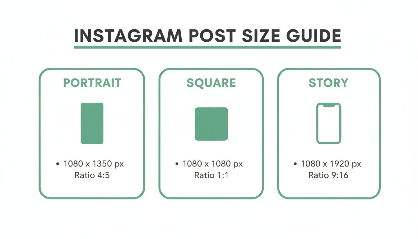
The main takeaway here is that while several sizes are "correct," each one serves a different strategic purpose on the platform.
From Humble Squares To High-Resolution Standards
Instagram has come a long way from its early days. When it first launched back in 2010, everything was a simple, 612x612 pixel square. That was it.
But as our phone screens got bigger and better, so did Instagram's standards. By 2015, the platform officially began supporting higher-resolution images, establishing 1080 pixels as the ideal width for feed posts. This ensures your photos look crisp and clear on modern devices.
That 1080px standard is now the baseline that all the pros recommend. It's the sweet spot to avoid the ugly compression that Instagram’s own algorithms can inflict on your images. If you're curious about how digital sizes stack up against traditional photo prints, it's interesting to see how formats like a what is a 4x6 picture compare.
The platform will often downscale oversized images and try to upscale small ones, which is why a 1080px width is the perfect middle ground. Uploading at this specific width—like 1080x1350 pixels for a portrait post—drastically reduces those fuzzy compression artifacts and keeps your details sharp.
Why Instagram Dimensions Matter
Ever tried to cram a widescreen movie onto an old, square TV? That’s pretty much what happens when you upload an image to Instagram without getting the size right. Instagram will force it to fit, but it might stretch, crop, or compress your hard work into a blurry, awkward-looking post.
Nailing the dimensions is your first line of defense against quality loss. It's a non-negotiable step if you're serious about your content. When you upload a file that doesn't match what Instagram prefers, its algorithm takes over, and the result is often far less impressive than what you started with. This can instantly undermine your professionalism and weaken your message.
But this isn't just about avoiding blurriness. It’s a strategic move that directly impacts how people engage with what you post. A perfectly sized image simply looks better, commands more attention, and feels more professional.
Let’s break down the key concepts you need to know.
Understanding Aspect Ratio
Think of aspect ratio as the shape of your canvas. It's the relationship between the width and height of your image, written as width:height. It doesn't tell you the size in pixels, just the proportional shape.
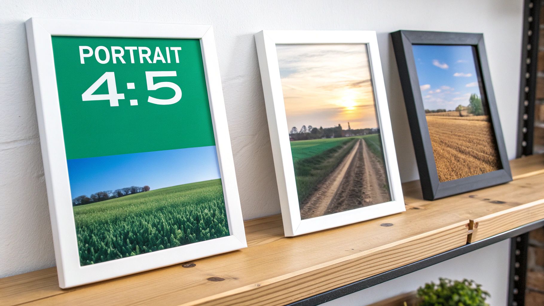
For example, an 1:1 aspect ratio is a perfect square—its width and height are identical. An 4:5 aspect ratio, on the other hand, is a vertical rectangle that's taller than it is wide. This is arguably the best size for an Instagram post in the feed because it takes up more screen real estate on a phone, making it much more impactful.
Mastering aspect ratio is the foundation of creating visually compelling content. By choosing the right shape for your canvas, you control how your audience experiences your image, ensuring nothing important gets cut off.
The Role Of Resolution
If the aspect ratio defines the shape, then resolution defines the quality. Resolution is all about the detail packed into your image, measured in pixels (px). More pixels mean a sharper, clearer photo. Simple as that.
Instagram has a sweet spot here. For feed posts, the platform really wants an image width of 1080 pixels. If you upload something massive, like a 4000px wide photo, Instagram will aggressively compress it to get it down to size, often stripping out a lot of that beautiful detail in the process.
On the flip side, if your image is too small (say, 500px wide), the platform has to stretch it to fill the space. The result? A pixelated, unprofessional mess. Aiming for that 1080px width gives you the most control over the final look.
Avoiding Instagram's Compression
Instagram’s main job is to load the feed quickly for millions of users at once. To do that, it automatically compresses every single photo and video that gets uploaded. Large, high-resolution files are the first to get squashed.
You can work with the algorithm instead of against it by prepping your content ahead of time.
Export at 1080px Width: Before you even think about uploading, resize your image so its width is exactly 1080px.
Use the Right Aspect Ratio: Stick to the recommended shapes:
4:5for portrait,1:1for square, or1.91:1for landscape.Keep File Size in Check: This isn't a hard rule, but trying to keep your final image file under 1MB can help minimize any extra compression Instagram might apply.
Optimizing these few things ensures your content looks exactly how you intended it to—sharp, clean, and ready to grab your audience's attention. It's the difference between a post that looks like an accident and one that looks intentional and authoritative.
Getting Your Main Instagram Feed Right
Think of your Instagram feed as your brand’s art gallery. It's the curated, permanent collection that shows people who you are. While Stories and Reels are great for those quick, in-the-moment hits, your feed posts are the foundation of your visual identity. To really stick the landing, you’ve got to get comfortable with the three core formats: Square, Portrait, and Landscape.
Each one has its place, but let's be honest—they aren't all created equal. Knowing when to use which format is the difference between a feed that just looks okay and one that truly performs. Let's break down how to use each one strategically.
The Classic Square Post (1:1)
The square is where it all started for Instagram. It’s clean, reliable, and still a totally solid choice for a lot of content. It fits perfectly into your profile grid, so what you see is what you get.
Recommended Dimensions: 1080 x 1080 pixels
Aspect Ratio: 1:1
This is your go-to for straightforward product shots or simple graphics with text. The balanced composition naturally draws the eye to the center. But its biggest strength is also its weakness—it doesn't exactly scream for attention in a busy feed.
The Often-Overlooked Landscape Post (1.91:1)
Landscape is your widest option, built for those sprawling scenic shots or big group photos. While it has its moments, it’s usually the least effective format for grabbing eyeballs.
Recommended Dimensions: 1080 x 608 pixels
Aspect Ratio: 1.91:1
Here’s the problem: because landscape posts are so short, they take up the least amount of vertical space on the screen. That makes it way too easy for people to just scroll right on by. My advice? Only use this when cropping to a square or portrait would completely ruin the shot.
The Undisputed Champion: The Portrait Post (4:5)
Alright, let's get to the good stuff. If you want to maximize your visibility and get more engagement, the portrait post is, without a doubt, the best size for your Instagram posts.
Recommended Dimensions: 1080 x 1350 pixels
Aspect Ratio: 4:5
The magic here is simple: it’s all about screen real estate. The taller 4:5 format literally fills more of the user's phone screen as they scroll. A bigger image demands more attention and makes people more likely to stop and look. This isn't just a hunch; it's a proven way to get better results.
According to extensive platform analysis, portrait posts using a 4:5 aspect ratio can occupy 20-30% more screen space than their square counterparts. This increased visibility often correlates with significant lifts in engagement, with some social media managers reporting uplifts as high as 30% when switching from square to portrait. You can find more deep-dives on optimizing social media images in Sprout Social's detailed guides.
That extra screen time is gold. It gives your audience a better chance to see the details, read your message, and actually engage with your content. Whether it's a stunning photo or a detailed infographic, the portrait format gives your work the space it deserves.
Composing for the Feed vs. The Grid
Now for one crucial catch. When you post that beautiful 4:5 portrait image, it looks amazing in the feed. But on your main profile grid? Instagram crops it down to a 1:1 square.
This means you have to compose your shots for both views at once. It’s easier than it sounds.
Frame Your Shot: As you're creating your 1080 x 1350 pixel image, just imagine a square sitting right in the middle.
Keep the Good Stuff Central: Make sure the most important part of your image—a face, your product, the main headline—sits safely inside that central square.
Use the Edges for Context: The top and bottom sections are for extra visual flavor. They add depth in the feed but aren't critical if they get cropped out on the grid.
Nailing this little trick lets you get all the engagement-boosting power of a portrait post while still keeping your profile grid looking sharp and professional. It’s a small step that makes a huge difference in how people experience your brand on Instagram.
Nailing Your Instagram Stories and Reels
Let's dive into the world of full-screen, vertical content. This is where Instagram Stories and Reels live, and they are designed to be completely immersive. The goal here is to take over the entire mobile screen and grab your audience's undivided attention.
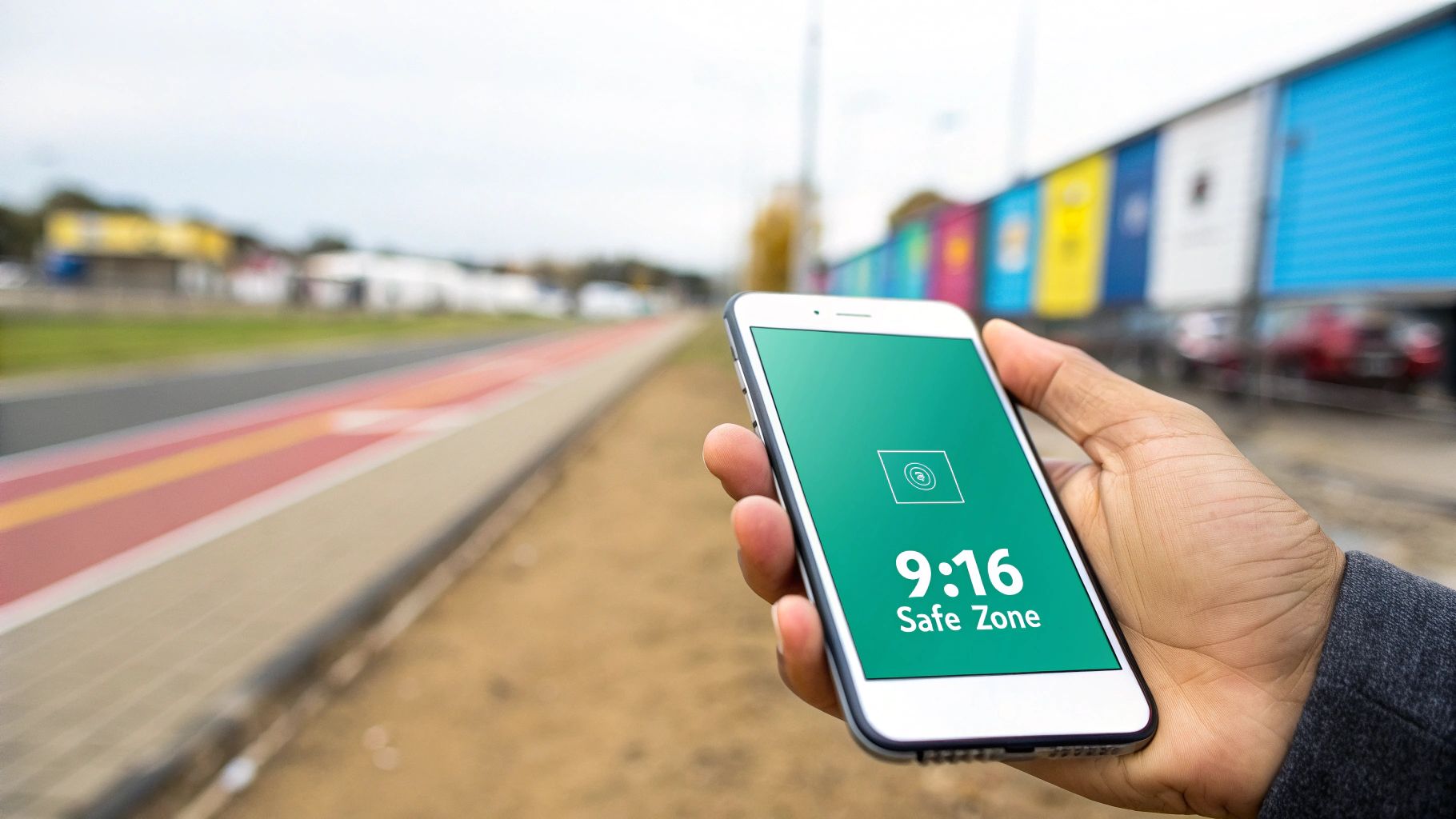
To pull this off, both Stories and Reels share the same ideal dimensions. The undisputed gold standard for this vertical canvas is a 9:16 aspect ratio. In terms of pixels, that translates to a crisp 1080 x 1920. Sticking to these exact dimensions is your first step to making content that looks sharp, professional, and purpose-built for the platform—no more awkward black borders or fuzzy compression artifacts.
But here's the thing: getting the dimensions right is just the start. The real trick to mastering Stories and Reels is working with the user interface that Instagram plasters all over your beautiful content.
Navigating the Instagram Safe Zones
Picture your 9:16 canvas as a stage. You've got the whole space to work with, but some parts are blocked by curtains and props. Your profile picture, username, the caption, and all those little engagement buttons (like, comment, share) take up prime real estate. If you stick crucial text or a logo in those spots, it's going to get covered up.
This is where the idea of "safe zones" becomes a lifesaver. The safe zone is simply the central part of your screen where your content is guaranteed to be seen, clear of any of Instagram’s UI clutter. It's a small detail that makes a massive difference in readability and user experience.
Here’s a quick cheat sheet to keep your content out of trouble:
Stay Out of the Top: Leave about 250 pixels of breathing room at the very top. This is where your profile info and other icons hang out.
Keep the Bottom Clear: You'll want to reserve roughly 250-300 pixels at the bottom. This space is home to the caption, audio details, and any call-to-action buttons.
Mind the Right Edge (for Reels): On a Reel, the like, comment, and share buttons stack up vertically on the right. Avoid placing any important text or visuals in that column.
By keeping your most important elements—logos, text, faces—within this central safe area, you make sure your message lands exactly as you intended. No frustrating overlaps, no hidden text. It's a simple tweak that immediately makes your content feel more polished.
Design Tips for Immersive Vertical Content
Once you've got the safe zones down, you can really start to play with the full vertical canvas. The aim is to create something that feels native to the platform and pulls the viewer right in. If you want to go even deeper, you can find a complete Instagram Story guide right here to get even more ideas.
Here are a few pointers for creating more engaging vertical content:
Shoot Vertically: This one's huge. Whenever you can, film and design your content in a vertical format from the get-go. Trying to crop a horizontal video into a 9:16 frame almost always looks clumsy and zoomed-in, cutting out key parts of the shot.
Use Full-Screen Graphics: Design your backgrounds and templates to fill the entire 1080x1920 space. This gives everything a cohesive, professional feel, even if the photo or video you're featuring doesn't fill the whole screen.
Direct the Viewer's Gaze: Use motion, text reveals, and stickers to guide the eye. The vertical format gives you so much room to lead someone up or down the screen, telling a little story along the way.
The key is to think vertically. Don't just drop a square photo in the middle of a Story. Build a visual experience around it that uses the entire screen, turning a simple post into a captivating, full-screen moment.
When you blend the right technical specs with a smart approach to the user interface, your Stories and Reels stop being just uploads. They become powerful, effective communication tools that give your audience a seamless experience—making them far more likely to stick around and engage.
Getting Carousels and Other Key Formats Right
Beyond single-feed posts and full-screen vertical content, a few other formats are the glue holding your professional Instagram presence together. When you nail these—from multi-slide carousels to your all-important profile picture—you ensure every corner of your account looks consistent and sharp.
Carousel posts, in particular, are absolute powerhouses for storytelling and deep-dive tutorials. They let you bundle multiple images or videos into one swipeable experience. But they come with one critical, often-overlooked rule that can completely sabotage your design if you're not ready for it.
This one guideline is the secret to creating a seamless, professional-looking carousel every single time.
The Golden Rule of Carousel Sizing
Here’s the deal: Instagram forces every slide in your carousel to match the aspect ratio of the very first slide. That's it. It’s non-negotiable. If your first image is a 1:1 square, every portrait or landscape image you add after it will be automatically and unceremoniously cropped into a square.
This means you have to lock in a single aspect ratio for the entire carousel before you even start creating.
For Square Carousels: Stick with 1080 x 1080 pixels. It’s clean, consistent, and looks perfect on your profile grid.
For Portrait Carousels: Go with 1080 x 1350 pixels. This is your best bet for grabbing attention, as it maximizes screen space in the feed and makes your multi-slide story even more immersive.
For Landscape Carousels: You can use 1080 x 608 pixels, but honestly, this is the least effective option because it takes up so little room on the screen.
Trying to mix and match sizes is a recipe for disaster. Plan your carousel around one dimension from the get-go to avoid that awkward, automatic cropping that cuts off key details and ruins your whole vibe. To see how top-tier brands pull this off, check out these inspiring Instagram carousel post examples that absolutely master the art of visual storytelling.
Your Profile Picture: The Digital Handshake
Think of your profile picture as your first impression. It shows up everywhere—on your profile page, in every comment you leave, in Stories, and in DMs. A blurry or badly cropped image just looks unprofessional and can chip away at trust before you’ve even started.
While Instagram displays your profile picture as a circle, you must upload a square image. The official recommendation is 320 x 320 pixels, but uploading a larger square, like 1080 x 1080, often gives you a much sharper result.
The most important thing? Make sure your main subject—your face or your brand's logo—is dead center. Anything hugging the corners of your square upload will get chopped off by the circular mask. Leave a little "safe zone" or buffer around the edges to guarantee your visual identity stays clear and recognizable across the entire platform.
Sizing Up Instagram Video and Live
These days, almost all videos uploaded to the main feed are treated as a Reel, which means they follow the vertical format rules we've already covered. Still, it’s good to know the specifics for standard video posts and going live.
Instagram Video Posts (Now Feed Reels) As a rule of thumb, just treat every video you post to the feed as a Reel. The best size for an Instagram post with video is the full-screen vertical 9:16 ratio (1080 x 1920 pixels). Sure, you can still upload a square or landscape video, but it just won’t deliver that same immersive, "made-for-mobile" experience.
Instagram Live Video Live videos are a bit different since you're broadcasting in the moment. They stream and display vertically in the 9:16 aspect ratio. There’s no post-production sizing to worry about here—just remember to hold your phone vertically! This simple action ensures you fill the screen correctly and give your viewers an engaging, full-screen experience.
Pro Tips for Flawless Instagram Uploads
Knowing the right dimensions is only half the battle. The real secret to a stunning Instagram feed is preserving your content’s quality during the upload process. Instagram's compression can be ruthless, but a few small technical tweaks can make sure your images and videos look just as sharp on the app as they do on your own screen.
It all starts with picking the right file format. For photos, JPEG is king. It might be tempting to use a PNG, especially for graphics, but Instagram converts everything to JPEG on its end anyway. Starting with a high-quality JPEG from the get-go gives you more control and helps you avoid any weird color shifts after you post.
When it comes to video, stick with MP4. It's the universal standard for a reason—it gives you the best possible balance of quality and file size, which is exactly what you need for smooth uploads and flawless playback.
Mastering Your Export Settings
How you save your file is every bit as important as how you create it. Think of your export settings as the final quality check before you send your content out into the world. This is true whether you’re working in professional software like Adobe Lightroom or a simple, user-friendly tool like Canva. Beyond just the dimensions, using the right social media content creation tools can really streamline your workflow and guarantee your visuals are perfectly optimized every time.
When you're ready to export, dial in on these key settings:
Color Space: Always, always export using the sRGB color profile. It’s the standard for the web, ensuring your colors look consistent and vibrant no matter what device someone is using to scroll through their feed.
Compression Level: For JPEGs, aim for a quality setting somewhere between 75-85%. This is the sweet spot. It dramatically cuts down the file size without any noticeable drop in visual quality, which gives Instagram’s own compression algorithm less to mess with.
File Size: While there isn't one magic number, keeping your photos under 1MB is a great rule of thumb. For videos, the goal is to keep them manageable to ensure a quick, smooth upload, which can actually impact the final quality. We dive deeper into this in our guide on how to upload high-quality videos to Instagram.
Beating Instagram's Compression Algorithm
Instagram’s number one priority is a fast, seamless experience for millions of users scrolling at once. To make that happen, it compresses absolutely everything that gets uploaded. Your job is to give its algorithm as little work as possible.
The single best way to beat compression is to upload content that is already optimized. By sizing your image to exactly 1080px wide and using the recommended export settings, you are essentially pre-compressing your file in a controlled way, leaving less room for Instagram’s algorithm to make its own, often harsher, adjustments.
One last thing: always try to upload your content over a strong, stable Wi-Fi connection. A spotty cellular signal can cause the upload to stall or fail, which can sometimes trick Instagram into posting a lower-quality version of your file. Taking these small technical steps makes sure every single post meets the high standards you’ve set for your brand.
Got Questions About Instagram Post Sizes? We’ve Got Answers.
Even after you've memorized all the rules, specific questions always seem to pop up right when you’re in the middle of creating something. Think of this section as your go-to troubleshooter for those nagging "what if" scenarios. We're here to give you clear, straightforward answers so every single post is pixel-perfect.
Let's clear up any lingering confusion. We’ll dive into what really happens when you upload an image that's too big, which file format is your best bet, and how to keep your text from getting awkwardly cut off in your vertical videos.
What Happens If I Upload an Image Wider Than 1080px?
If you upload an image wider than Instagram's recommended 1080 pixels, the platform will automatically downsize and compress it for you. This sounds helpful in theory, but it means you're handing over control of your image's final quality.
Instagram's compression algorithm can be aggressive. It often leads to a noticeable loss of sharpness, weird color artifacts, or just a generally "soft" look. By resizing your image to 1080px wide before you upload, you get to control the final sharpening and compression yourself. It's the best way to make sure your work looks as crisp as possible.
Should I Use JPEG or PNG for My Instagram Photos?
For almost any photograph you post, JPEG is the way to go. It delivers fantastic image quality at a much smaller file size, which is exactly what you want on a mobile-first platform that needs to load content quickly.
Here’s a little inside baseball: Instagram converts every image to a JPEG on its servers anyway. Uploading a PNG can sometimes cause unexpected color shifts or compression problems during that process. To keep things simple and predictable, stick with a high-quality sRGB JPEG for all your photos.
The one exception? Graphics with sharp, defined lines and large blocks of solid color. A PNG might hold up a tiny bit better in that specific case. But for 99% of what you see on Instagram, JPEG is the undisputed champion.
Does the Best Post Size Change for Business Accounts?
Nope. The recommended dimensions and the best size for an Instagram post are the same for all account types—personal, creator, or business. The platform's technical specs don't care about your account status.
That said, if you're running a business account, you should be extra diligent about getting it right. A polished, professional brand image depends on it. Using the optimal 4:5 portrait size (1080 x 1350 pixels) is especially crucial for businesses. It takes up more screen real estate, which has been proven to boost user engagement and directly help your marketing goals.
How Do I Keep Text Readable in Reels and Stories?
To make sure your text is always easy to read, you have to keep it inside the "safe zone." This is the central part of the screen that isn't covered by Instagram's buttons, icons, and other interface elements.
As a rule of thumb, avoid placing any critical text, logos, or calls-to-action in these areas:
The top 15% of the screen, where your profile info and icons live.
The bottom 20% of the screen is reserved for the caption and engagement buttons.
Always—and I mean always—use the preview feature before you hit publish. It’s a simple check that can save you a world of frustration and ensure your message gets across loud and clear.
Ready to turn those perfectly-sized posts into real growth? Gainsty uses advanced AI and expert strategies to help you get more organic followers and engagement on Instagram. Start growing your audience the right way, without bots or fake followers. Find out how at https://www.gainsty.com.
.png&w=1920&q=75&dpl=dpl_8KG1f7WRqi6nU8itgTRMtPYKBHCy)


.png&w=750&q=75&dpl=dpl_8KG1f7WRqi6nU8itgTRMtPYKBHCy)