Why Instagram Collapses Your Caption Spacing
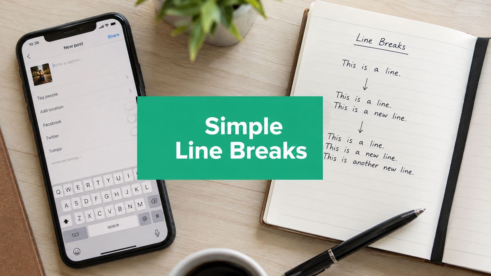
Instagram doesn't reliably preserve visually typed blank lines unless the break is created without an extra space before the Return/Enter key. That's the core rule, and it explains why a caption can look formatted on your phone but collapse after you publish. If a space sneaks in before the line break, Instagram can treat the break differently and flatten the paragraph structure.
The cleanest habit is simple. Type your last visible character, stop, and press Return immediately. Don't add a space after punctuation, don't pad the end of the line, and don't mix spaces with returns as if they're interchangeable. The platform is much more consistent when it sees a clean paragraph separator than when it sees hidden trailing whitespace.
What usually goes wrong
A lot of people think they're using line breaks correctly because the caption looks spaced out in the editor. The failure happens one layer later, when the app processes pasted or typed text and strips out what looked like blank space. That's why the same caption can behave differently depending on whether it was typed live, pasted from a notes app, or sent through a scheduler.
Practical rule: treat the last character on every line as the final input, then hit Return with no extra tap, no spacebar, and no hidden padding.
That rule matters because every workaround in this guide depends on it. If you understand that Instagram is picky about how the break is entered, you'll stop blaming the wrong part of the workflow and start choosing the method that survives the app's formatting logic. In practice, that's the difference between a caption that reads like a polished post and one that looks crammed into a wall of text.
Creating Line Breaks Directly in the Instagram App

The native-app method is the fastest option when you're posting on the fly. Finish the line, make sure your cursor sits directly after the last character or punctuation mark, and press Return immediately. If a space slips in first, the break can fail, so the discipline is in the pause before you tap the keyboard.
iPhone and Android quirks that trip people up
On iPhone, the stock keyboard often feels straightforward, but autocorrect can add spacing behavior you didn't intend. Third-party keyboards can be less predictable, especially when predictive text is active and tries to “help” between punctuation and the return key. On Android, the same problem shows up in a different way, because keyboard behavior can vary more between devices and brands.
Samsung keyboard users sometimes notice that the caption looks correct in the editor, then loses structure after posting. Stock Android keyboards may behave more consistently, but the safe habit is the same across devices, no trailing space, then Return. If you're switching keyboards mid-caption, stop and recheck the cursor position before every break.
The muscle-memory version
For short posts, I use a repeatable sequence.
Type the sentence fully. Don't leave a space after the last word or punctuation.
Tap Return once. If the cursor moves down cleanly, keep going.
Repeat the pattern. Every paragraph needs the same clean finish.
Preview the caption visually. If the structure feels off, stop and rewrite before posting.
This works best for quick updates, short promos, and captions you're comfortable editing live. It's weaker when you're writing a longer brand story, because the more you type directly in the app, the more chances you give keyboard behavior to interfere. For those posts, the copy-paste route is usually safer.
The Copy-Paste Method Using Notes Apps

Drafting outside Instagram gives you far more control over spacing because you can manage line breaks before the app touches the text. The cleanest workflow is to write the caption in Notes, Google Keep, or a plain-text editor, then paste it into Instagram after the layout looks right. Instagram treats pasted text differently from text typed directly into the caption field, so this method usually holds spacing better.
Why notes apps win
Plain-text tools reduce the formatting baggage that can travel with a caption. Rich-text apps can carry hidden styling, and that extra formatting is often what causes trailing spaces, odd indentation, or broken line breaks when you paste. If you have ever copied a caption that looked fine in one app and came out shifted in another, that is usually the reason.
This method also helps with longer captions because you can read the whole piece before anything goes live. You can tighten the hook, move the CTA, and shape the spacing as part of the post instead of treating it as a cleanup step at the end. For iPad users who draft a lot, top 10 iPad productivity apps can help you choose a writing tool that feels comfortable for long-form caption prep.
A clean draft-and-paste workflow
Draft in Notes. Keep the caption in plain text if possible.
Add your line breaks deliberately. No spaces before returns.
Copy the full caption. Check that the selection includes every paragraph.
Paste into Instagram. Review the spacing before you publish.
If your draft app is acting strangely or formatting keeps disappearing between devices, Instagram Notes not working is a useful troubleshooting reference. For another productivity angle on Apple devices, pair your drafting with a notes-based capture habit. That keeps caption ideas and final drafts in one place, which helps when you are moving between the phone, iPad, and scheduler.
The main trade-off is speed. Typing directly in Instagram is faster, but drafting outside the app gives you more control, cleaner paragraph breaks, and fewer surprises when the caption goes live.
Using Invisible Characters as a Spacing Fallback
When returns collapse and copy-paste still mangles your spacing, invisible characters become the backup plan. Practitioners use invisible-space blocks, copied blank character sequences, or line-break generators because they preserve blank lines and reduce formatting loss during paste. That makes this method useful when Instagram won't respect the structure you typed by hand.
How to use the fallback
The simplest version is to copy a blank character sequence from a generator or save one in your notes for reuse. Place it on the line where you want the gap to survive, then paste it into the caption between paragraphs. Instagram sees a character there, even though it looks empty to you, which helps the spacing survive a paste that would otherwise collapse.
If your caption keeps flattening, stop trying to force a normal return to work and switch to a saved invisible block.
This is not the first method I'd use for every post. It's the backup when the normal route fails, especially on devices or input methods that keep stripping your breaks. The advantage is consistency, but the trade-off is that you're depending on a workaround instead of the cleaner native behavior.
Where this fits in a real workflow
I keep invisible spacing in reserve for scheduled posts, captions that must preserve exact formatting, and edge cases where the app or keyboard is acting up. It's also useful when you're posting from different devices and don't want to relearn the spacing behavior every time. For a broader brand profile, keep an eye on how spacing works in your other bio or profile text too, since formatting habits often travel across fields, and a guide like Instagram bio spacing can help keep that consistency.
Accessibility matters here. Some screen readers may interpret invisible characters, so use the technique carefully and only when the formatting benefit is worth it. If you don't need perfect blank lines, a plain paragraph break is usually the cleaner choice.
Troubleshooting Spacing Failures by Device and Workflow
Most guides stop at “press Return,” but that advice breaks down in real use because the failure isn't always the same. The hard part is diagnosing whether the problem is your device, your keyboard, or the way the caption is moving through a scheduler. The same formatting advice can sound universal while still failing in one workflow and working fine in another.

Match the fix to the failure
If your caption looks fine before posting but collapses afterward, the issue is often in the transfer step. That's where copy-paste from a notes app usually beats typing inside Instagram, because the draft lives in a cleaner text environment before it gets imported. If the spacing fails only on one device, test the same caption on another phone or switch keyboards and see whether the break survives.
Scheduling tools can create a different kind of problem. A caption may look formatted in the planner, then lose structure when the tool imports or republishes it through Instagram. In that case, re-paste the formatted text after the import step, instead of trusting the scheduler's preview blindly.
A quick diagnostic checklist
Extra characters? Remove trailing spaces, punctuation padding, and hidden formatting before every line break.
Inconsistent device? Test the same caption on iPhone and Android, because keyboard behavior isn't identical.
App version outdated? Update Instagram and your keyboard app if spacing suddenly changes after a refresh.
Platform glitch? Save the caption, wait, and try again later if the break fails without any obvious input mistake.
For a deeper look at the common failure patterns people run into with line breaks and device behavior, this troubleshooting discussion on Instagram caption spacing is useful context. The bigger point is that spacing failures are usually workflow problems, not just typo problems.
If you want a structured way to choose your fix, use this rule. Native app typing is best for short captions, notes app drafting is better for precision, and invisible characters are the fallback when the break keeps disappearing.
Formatting Captions for Readability and Engagement
Spacing isn't just cosmetic. A caption with clear paragraph breaks is easier to scan, easier to finish, and more likely to feel worth reading on a phone screen. That matters for creators and brands because the structure of the caption affects whether the message gets read at all.

Make the spacing serve the message
Keep paragraphs short enough for mobile scanning. Two or three lines per paragraph usually feels lighter than a dense block, especially when the first line carries the hook and the next lines add detail. If you bury the point too deep, readers scroll past before they know why they should stay.
Use line breaks to create visual rhythm, not just empty air. A clean break before a key detail can make the caption feel intentional, and a break before the CTA can separate the story from the ask. That's one reason the same caption can feel more polished with spacing than without it, even when the words don't change.
Readability rule: if the caption looks like a wall, it feels longer than it is.
Connect spacing to the rest of the post
Bullets, emoji markers, and symbols can help when you need structure without turning the caption into a list. They work especially well for product drops, event announcements, and educational posts where the reader needs a quick map through the text. For video-first creators, mastering Instagram Reels for engagement pairs well with caption spacing, because the caption has to support attention that the video already earned.
Keep accessibility in mind if you rely on invisible characters for spacing. Some screen readers may vocalize them or make the experience awkward for followers who use assistive tech, so don't use a workaround just because it looks neat on your screen. If you're writing captions from scratch, the same Instagram caption writing guidance can help you shape the copy before you start formatting it.
The cleanest captions are the ones that feel easy to read on the first pass. If your spacing helps a reader move from hook to story to CTA without friction, it's doing its job.
Gainsty helps creators and brands build Instagram content workflows that are easier to manage, from caption writing to organic growth support. If you want a faster way to draft, test, and refine captions without fighting spacing issues every time, visit Gainsty and see how its tools can fit into your posting process.